epilepsy warning
this site contains flashing imagery
please click here to disable the flashing effects
or anywhere else to hide this message

epilepsy warning
this site contains flashing imagery
please click here to disable the flashing effects
or anywhere else to hide this message
I've jumped into 2016 by making a new plan for the next three months. Thinking back over the last year, some things have gone well, others haven't.
It's difficult working on a long term project like an indie game, a lot of time and effort has to go into it behind the scenes and integrating that into daily life is something I find challenging to balance. That said - I'm excited by the plans I have for 2016 and through making that plan it's given me a bigger drive to knuckle down and focus on what's important. I couldn't recommend more taking the time to sit down and think about what is the *most* important - and structure your workplan towards that. It's more fun to spend *all* your time making the game you want to make, and tweaking that to perfection, but, let's be honest - that time is wasted if you're not coming up with a strategy for getting people to actually *play* your game.
A big stepping stone for me this year is Kickstarter. I really want to get my project up there soon to finally gain some funds to push the development forward faster. For the Kickstarter to succeed though, I need to get people to know about it. I'm trying to be a bit more active on Twitter - not something that comes naturally to many developer types! I'm finding it quite fun - though I have to remember that there is a purpose to it (getting people to see my game!) - it's not just for drooling over everyone else's fantastic projects!
I'm aiming to hit Kickstarter towards the end of March, and my preparation is split into three tiers of activity:
I've split these down further into smaller areas, and my primary goal for the first couple of weeks has been mainly focussed around 'Spreading the word' - though admittedly the quiet and boring side of this. That means:
The website is functionally complete - it's just the boring browser testing side of things. If anyone else is into web design and knows this pain, I salute you. With the proliferation of browsers about, it's an inevitably frustrating part of web design. Things can be made easier with the use of good tools - I'd recommend SauceLabs or BrowserStack to help with testing across different browsers and devices.
So yeah, the new website is nearly done, I'm extremely pleased with how it looks and I'm really looking forward to revealing it this weekend!
Alongside all this less interesting but perfectly wholesome activity I've worked on a few fun additions to the game, particularly focussing on fun visual things.
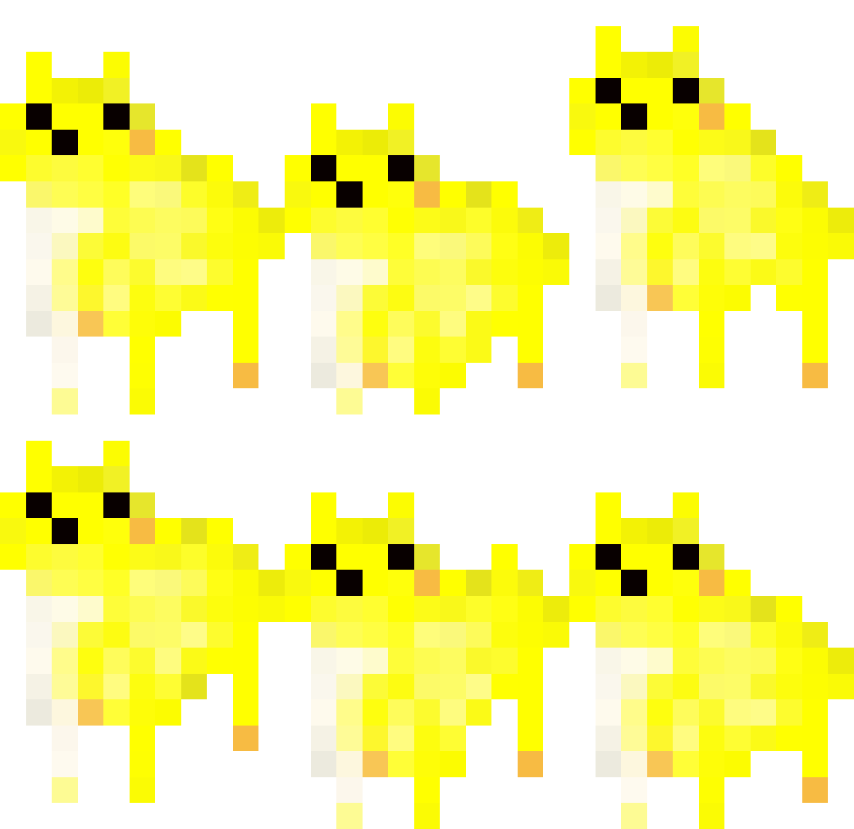
The first thing I did, inspired by seeing other people's (particularly @wtfmig) more fluid and bouncy animations, was create a fun jumping animation for our feline protagonist.

Jump Jump Jump
I'm not planning on enabling the player to jump on command, but this animation has some real character to it so I think I'll be using it to show when you acquire a particularly nice pickup or some other positive event.
After experimenting with some different ways of creating new psychedelic imagery and animations, I came up with this very tasty animation which I decided to use as a splash screen.
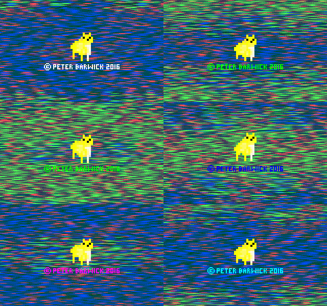
Nice. [high res]
Of course, I didn't think it had *quite* enough going on it it - so as ever, a splash of confetti always goes down a treat. This is my new splash screen for SUPER MEGA BEST CAT ADVENTURES - I love seeing it every time I fire the game up for testing, but now I'm itching to overhaul all the menu screens!
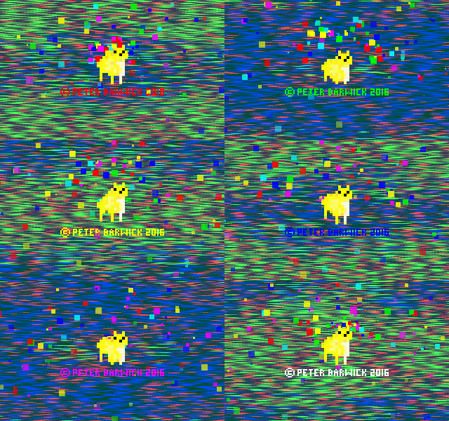
Classy! [high res]
Finally, the last addition I made was a subtle practical one. If the player walks behind some scenery, the scenery fades a little so that you can see behind it. It's a very slight effect, but I believe tiny touches like this are really important - I never want the player to feel cheated when they are playing - deaths should be fair!
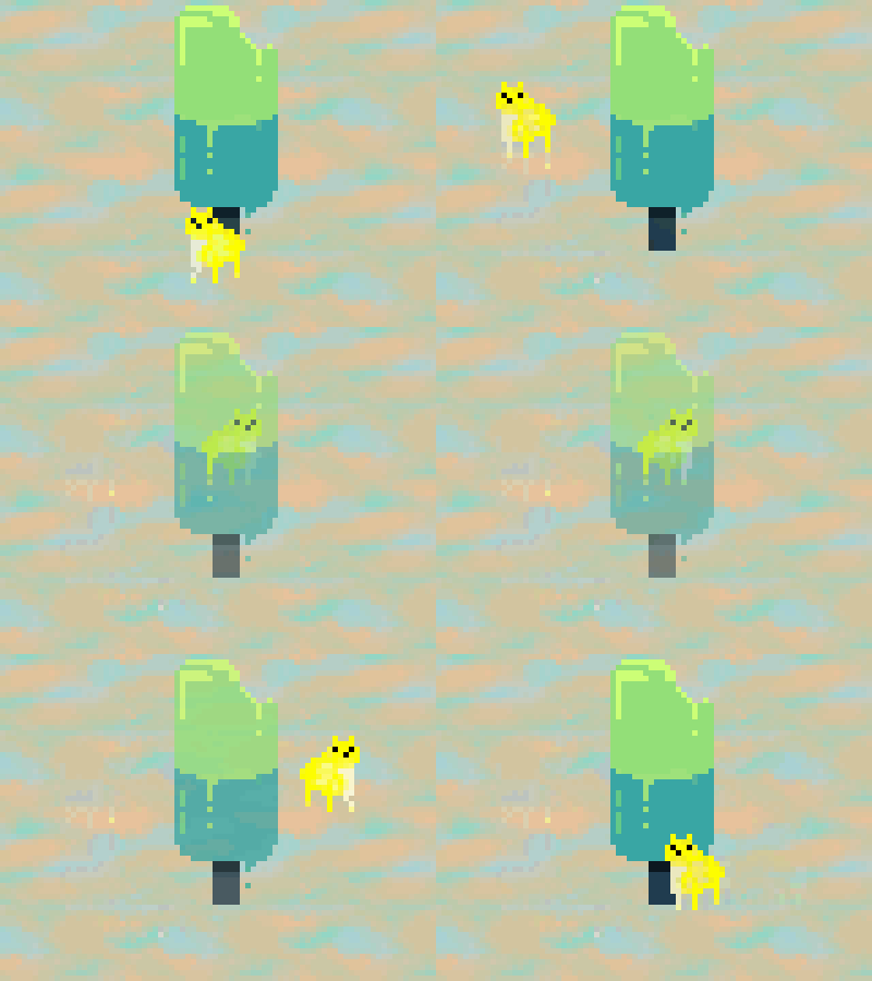
Small but useful - sorry, not sure why potato GIF
All in all, lots of fun little bits this week!