epilepsy warning
this site contains flashing imagery
please click here to disable the flashing effects
or anywhere else to hide this message

epilepsy warning
this site contains flashing imagery
please click here to disable the flashing effects
or anywhere else to hide this message
For the last couple of months I've been working behind the scenes on a new website for SUPER MEGA BEST CAT ADVENTURES, but after getting a little inspiration from another developer I decided to try out a few custom fade effects.
I saw the tweet below, which displayed a great looking transition which I wanted to try out myself as it instantly game me some other ideas.
The effect consists of a small animated tile that is generated in a grid across the screen, and given an offset to start the animation. The offset increases in both the X and Y axis to give a 'sliding-fade' effect. I'm going to randomise the direction of these offsets, as I'm always looking to put in as much variety as possible.

My implementation of @_Zephni's effect [high res]
I think this looks pretty smooth, and gives a bit more flair to when the gameplay is resumed. I can imagine effects such as this being used to restart the gameplay after a death, or at the start of a new level, for example.
Thinking about what other transition implementations I could try to give more character to the scene, I started on a twisting version, where each black tile on the grid would disappear one segment at a time, so that the action then 'windmills' into view.

An image to explain 'windmilling', for lack of a better phrase
After a little effort, a spinning effect was made, this time I didn't give an offset to each 32px square, because they didn't match up well.

Spinning effect [high res]
Because this effect clearly is defined by the boundaries of the tiled animation, it looks pretty blocky to me and not as smooth as the first example. I thought about ways to make the effect appear to be a little more subtle - the best ways to blur the lines of tiled objects is usually to make the image bleed over onto other sides of itself.
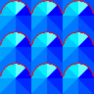
I wanted the boundary between each animation tile to look less obvious, so made a new simi-circular mask over the top to give it a softer edge, and hopefully this looks more like a series of scales or villi.

When the animation is playing, the top left and right are now continuations of the bottom left and right segments.

When tiled, you can see how the effect will work more clearly, and how the nature of the tiling is less obvious - giving a more natural look
Finally, we can apply what we have learned to the engine and see what it looks like!

Final implementation [high res]
Much better! The ingame version is even better as the animation is far smoother. I've added extra frames of animation as half-segments compared to the example shown above.
So once again thanks to @_Zephni for the inspiration, it's worth spending a little time on small details like these to make the game feel more rounded. I've still got a few more things I'd like to experiment with, which I'm looking forward to trying out and sharing.