
epilepsy warning
this site contains flashing imagery
please click here to disable the flashing effects
or anywhere else to hide this message

epilepsy warning
this site contains flashing imagery
please click here to disable the flashing effects
or anywhere else to hide this message
Over the last couple of weeks, I've been continuing to work on the assets for Kickstarter, and I'm also excited to say that I took the opportunity to redesign and tighten up the logo for the game. On the Kickstarter front, I've been finalising the banners to go in my 'story' (essentially the project description). These are great for brightening up what might otherwise seem a big chunk of text, and allows me to really inject some life into the page. Here's a flavour of how the look of one graphic evolved from a rough sketch into the final design.
As I was writing my first draft of the Kickstarter, I found it super helpful to put some sketchy placeholder headers into the text to give me a clearer idea of the flow of what I was saying. I'm a visual person, so doing things like that helps keep me focused. I didn't want to spend too much time on these, the idea was just for it to be a visual aid and I wasn't planning on showing it to anyone! (oh)
Maybe I should have just used this
After a while, it came the time to replace the crude but functional design above with a shiny super-mega-best version. The design aesthetic of SMBCA could be summarised as 'All the colours, all the time', so I set about realising the animated rainbow background that I had in mind.
My first design, complete with scrolling background and high contrast black and white text chosen so as to pop-out from the background. A good start, but I wanted to add a bit more pizazz to it, with some nice 'on-brand' strobing effects.
I wanted to try a subtle flashing pale highlight around the black text, as I thought the high contrast in the black text and white out line looked good and I wanted to preserve it. I also took out every other frame of the rainbow animation to reduce the size of the GIF by 50% as it was already over 1.3MB and I don't want the Kickstarter page to load too slowly. My target for images on the page is between 0.5-0.8MB per image maximum. I could have reduced the framerate of the animation by 50% so that it scrolled at the same speed as before, but I preferred the faster movement.
Added a similar, but darker, hue shift on the black text. This was my 'vision' for this graphic, but I felt it didn't pack enough punch.
Following the design principles Super Mega Best Cat Adventures a bit more closely, I pushed the colours to max-saturation and my favourite 6 step palette, with the 'opposite' colours used for the outlines of the text. To explain what I mean about the colour palette, I've made this little diagram..
Max saturation colours, with their complementary partners below
The UI and in game text uses these six colours, rapidly switching between them. It's an old trick, but using the complementary colour opposite in the colour wheel to the chosen colour really makes the text pop out of the screen.
Added a border to frame the image. Lovely! I'm going to make all the headers for the descriptive sections of my project look like this.
---
I spent a little time re-designing the logo for the game, as when I was producing assets for the Kickstarter the old version didn't quite look sharp and crisp enough at different resolutions. Here is the original title:
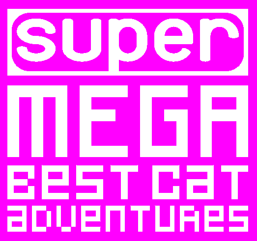
Old title
And here is the new version!
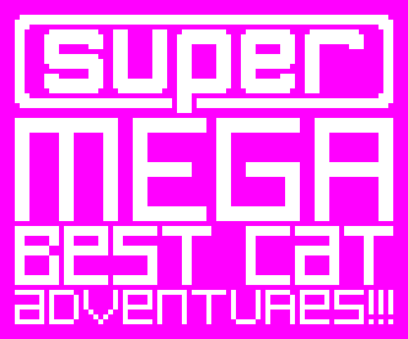
so different isn't it
I added 2 little details that fit better with the vision I have for the project. A great suggestion from Phil Duncan of Ghost Town Games (working on the wonderful looking Overcooked was to let the hanging 'p' in 'super' cut through the border with a little spacing, and Matt Luard (creator of The Cat Machine) made the eye opening point that "it's a title that needs to be shouted", which made me think of adding the playful three exclamation marks at the end.
And then of course I made it flash and stuff
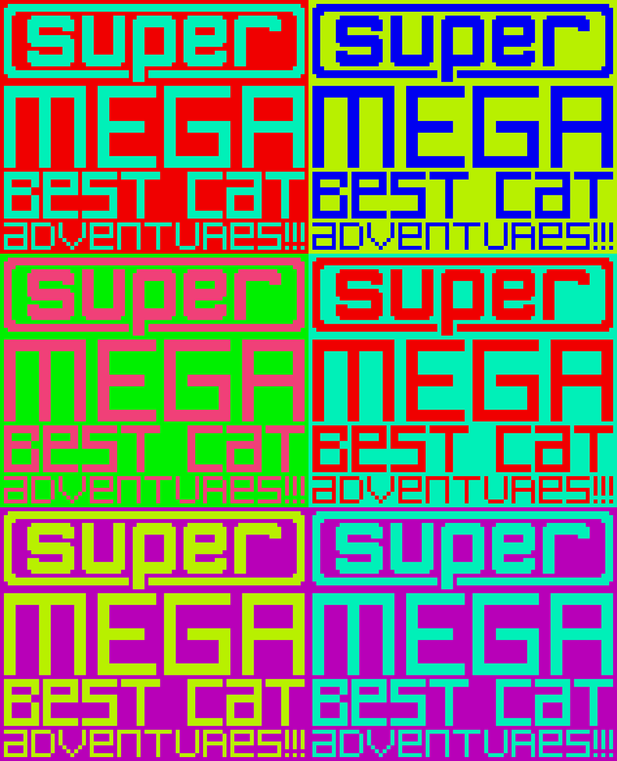
I like the twitter so send me a tweet over there if you want to, or you can comment on this development blog on the TIGSource forums if that's more your cup of tea
X